Starling Community Services
Rebranding for an evolving client base
The Challenge:
Lutherwood is a not-for-profit social services provider of mental health, employment and housing services in Waterloo Region. They have been providing these services since 1970 and are seen as an integral member of the community’s support services landscape. Over its lifetime, the organization and its team have been a consistent advocate of and supporter to the region’s vulnerable youth and those who find themselves in need of additional support. Their services have expanded to include employment and housing assistance.
What has changed since its inception is the demographics of the community. Waterloo Region is a much more diverse area than it was 50+ years ago and the reference to the Lutheran church no longer resonates with those they are looking to support.
Due to their value of supporting clients in ways that they need to be supported, Lutherwood decided to rebrand and change their name proactively.
The team was very clear in what they needed in a new brand. It must be:
- Neutral and agnostic
- Sound friendly, open and accepting
- Easy to read and say
- Unique from similar service providers in the greater area
What We Delivered:
A new name and visual identity
Lutherwood started their rebrand working with another agency. When it became apparent that the names suggested weren’t aligning with their goals, the team approached Studio Locale for our help.
Our team quickly got up to speed with the work from the past year and the names already considered. We delved into their values and overarching mission to be a support partner for anyone in the community.
Priding themselves on offering multi-services across various life stages and focusing on what the individual needs vs. a one-size-fits-all approach, we explored names that reflected this. What started as an exhaustive list was narrowed down to two front runners that would be shared.
Rebranding an existing organization can be challenging, especially when it’s not a result of something negative. There can be personal biases brought to the discussions during reviews and selection – those caused by a concern of choosing the wrong name or a reluctance to the rebrand in general.
To help reduce any personal hesitations or negative associations, our team took care to present the story behind each option. In addition, they were presented to the core team alongside unique visual identities. This helped frame the new brand to the core team and board members, similar to how others would see it for the first time.
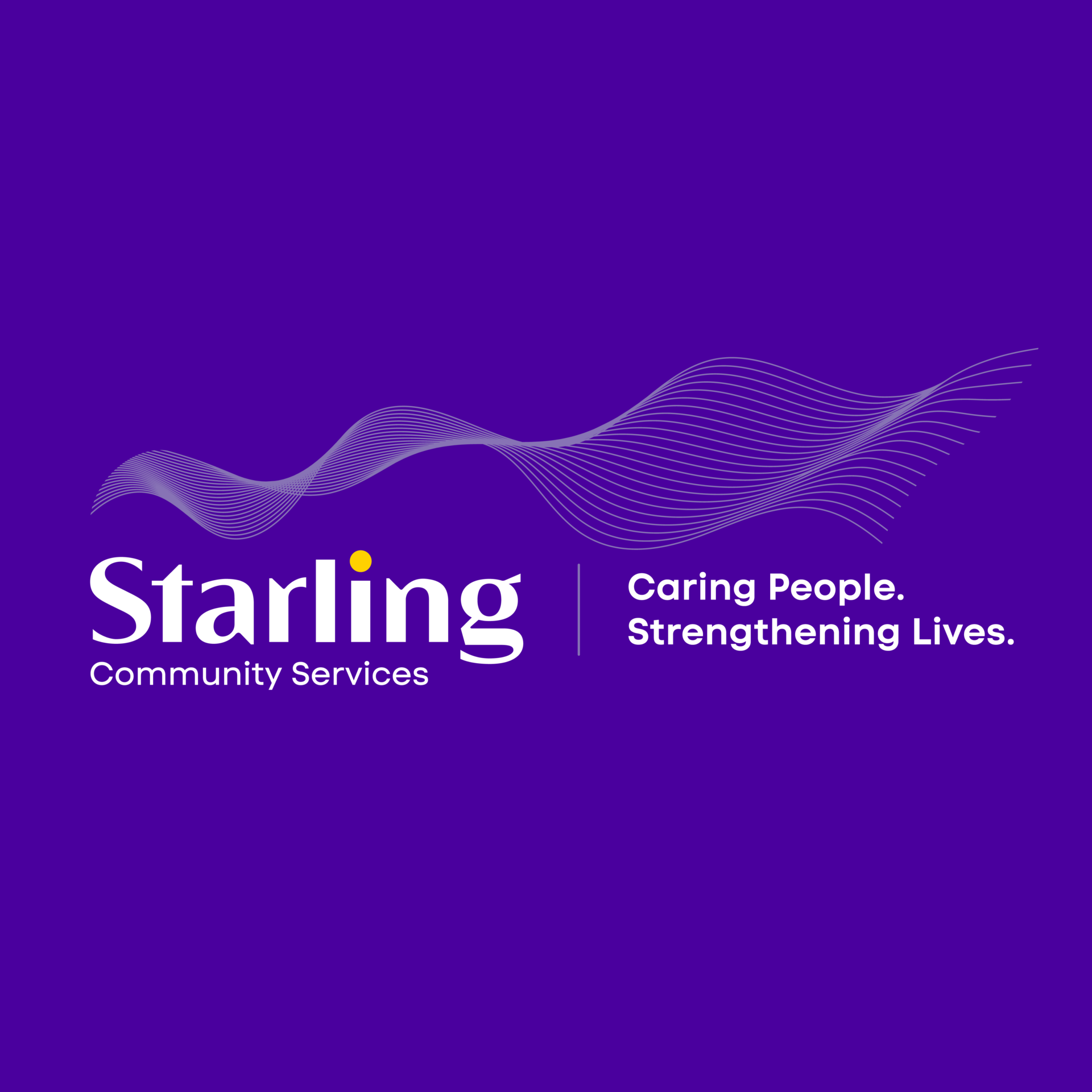
Starling Community Services was chosen as the new name. It reflects their core values of hope, togetherness, agility and guidance. Starlings work together, moving as one, smooth and fluid. They react to the closest six birds around them, creating beautiful patterns as they all fly and work together.
This new name pairs really well with their outward statement: Caring people. Strengthening lives.
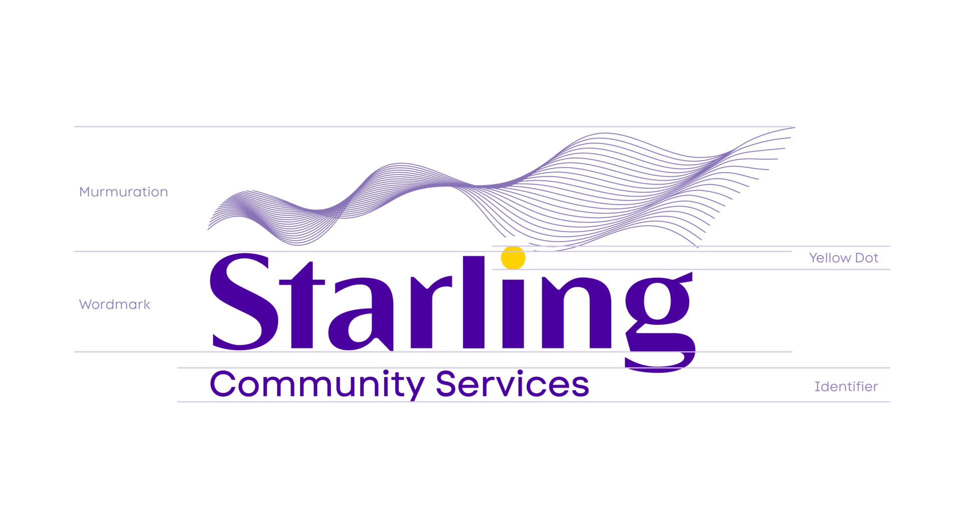
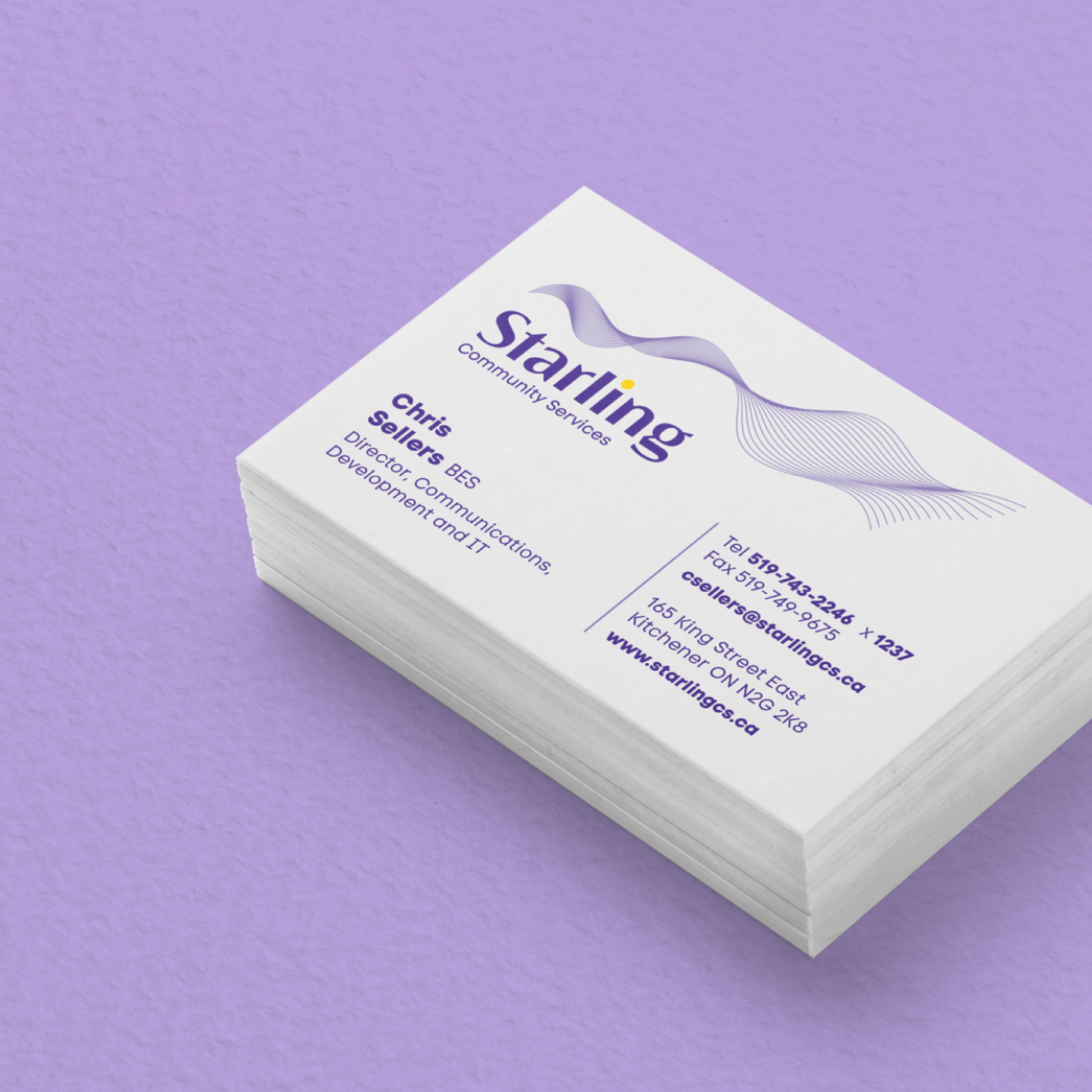
The visual identity was crafted using a font that has a sense of their legacy, but is also still modern with a welcoming quality to it. The element above the name is referred to as a murmuration – the name of a group of starlings. This supports their culture of moving forward, shifting as needed to support their clients.
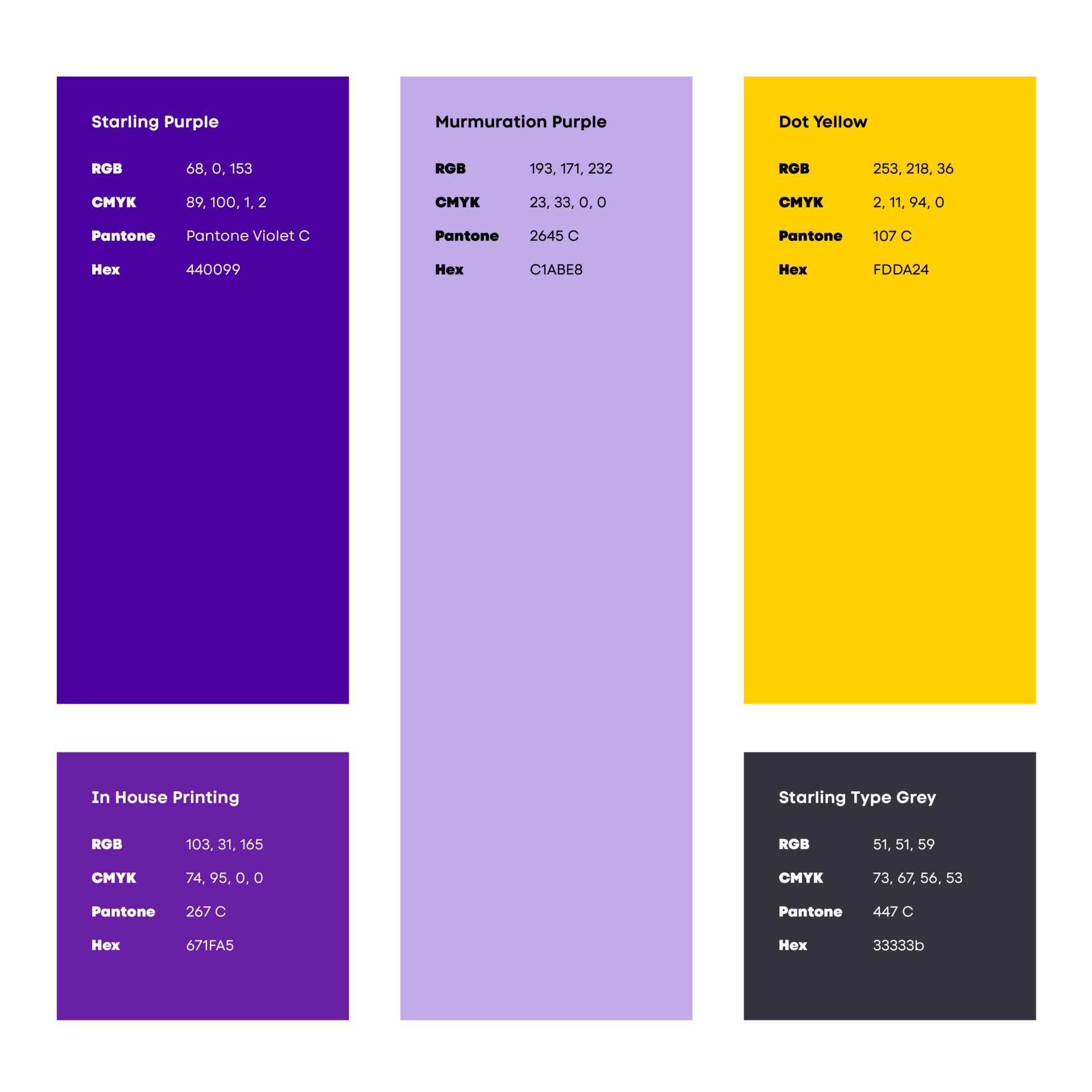
When it came to colour selection, we used images of starlings for inspiration. We found that purple appears depending on how the light reflects off the bird. This is similar to how we see them working with their clients, when you look at challenges from a different perspective or angle it presents different opportunities to work through them.
The colour purple can be associated with so many different things; creativity (a nod to their culture of innovation), mindfulness & calmness (thanks to the undertone of blue), as well as energy (with the red component).
Brand introduction video
As with any larger organization, rolling out to the team can induce a bit of anxiety. To help with the introduction of the new brand to their board as well as their entire staff, a launch video was developed to link the new name with their values and services. In doing so, the team understood that all of the work they had helped with to summarize their values and what made them different, had been used as the foundation for the new name development.
This link to all of their efforts and input supported the internal and external launch of the new brand identity.
Brand playbook
With an internal communications team, they needed the tools to let them roll out the new brand across all of their internal communication materials.
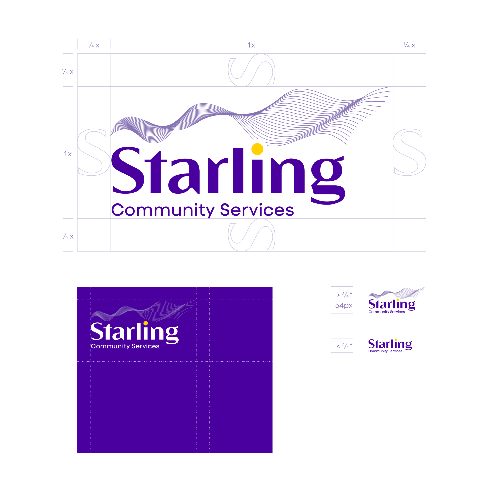
The Brand Playbook provides them with all they need to successfully manage the new brand and includes logo variations, logo sizes, logo dos and don’ts, along with the complete colour palette that can be used.
Website updates
Studio Locale designed the Lutherwood website in 2022. When we build websites, we develop them in such a way that it’s easy to make updates should there be any changes within the brand. So updating the website to reflect the new Starling Community Services brand was really smooth.
The Results:
The Starling team and community has responded to the new name in a wonderfully positive way. Their CEO is proud to introduce their new brand with other organizations and community partners, and is thrilled with how it’s re-energizing their internal team.
“We came to Studio Locale with a branding challenge. Lutherwood started as a service to help 10 youth struggling with their mental health and had grown to a multi-service agency aiding more than 18,000 people annually. After conversations with the community and staff, we realized that we needed a new name that honoured our past and reflected our welcoming, equitable services.
After a year of research and discussions, we had hit a roadblock. Studio Locale stepped in, asked key questions, and proposed Starling Community Services. The name ‘Starling’ symbolizes teamwork, adaptability, and resilience, much like our staff and services, and the root word ‘star’ represents guidance (stars) and quality (gold star). Studio Locale also designed a logo inspired by starling murmurations and a colour palate to represent and harmonize our three distinct service areas. We are very grateful for their creativity, ability to integrate into our process, and invaluable support of our branding journey.”
Chris Sellers
Director of Communications
Starling Community Services
Industry
Social Services
Discipline
Naming, Logo, Website, Graphic Design, Marketing Materials
Project Team
Anneta Wamono
Anson LeClair
Erynn Hayden
Jessica McLachlan
Truc Hoang
Philip Mondor
Robin Mondor
February 11, 2025
Managing your online product catalogue through your website
November 20, 2023


