

Time to rebrand or refresh your logo?
There is often a belief that a company’s logo should not change.
There is brand recognition and equity in a logo that has taken time to build and modifying it is throwing away all of the value you have worked hard to achieve. That said, there are cases where changing your logo is the most logical next step in furthering your brand value and improving the relationship you have with your customers. So when is the right time to rebrand or refresh?
Does it make sense to keep an existing logo or is it time to rebrand?
A well-designed logo might stand the test of time, but then again, there may come a time when it needs a bigger overhaul.
General Motors updated their logo in early 2021. It was the first major update of their identity in over 50 years. The rebrand supports their shift in focus to electric vehicles and reflects the updated mission of a cleaning future.
Burger King also launched a revived brand. They wanted the perception of their food to shift from the unhealthy views of the past and reflect their new mission of healthier fast food. The new look is more nostalgic to its past while also introducing bold, playful elements that are very much in line with current trends.
So how do you know whether your logo still works or if it’s time for a rebrand? If your target audience does not think of your brand the way you’d like, it might be time for a rebranding exercise.
Here are a few considerations when evaluating whether to rebrand:
- Does your logo still match your brand positioning?
- Have you progressed past start-up stage?
- Have you merged with another company?
- Has your business expanded into a new market?
- Does your visual brand still align with your target market’s values?
When will a refresh do the job?
There are times when a logo just needs to be updated. These changes are not drastic and typically consist of a slight modification or enhancement. Visually, your logo will be different when compared to the previous one, but the changes are more subtle and the brand equity remains intact.
Even the oldest brands that are household names, like Coca-Cola, have changed. For over 100 years, the brand has evolved to keep its appeal, stay fresh, and be competitive in the market. Each new version keeps the core elements of the brand intact to remain recognizable.
The key to an effective update is making sure your visual identity still matches the message and brand position you occupy, or wish to occupy, in the marketplace.
Here are a few considerations when approaching a logo refresh:
- Are there some slight modifications you could make to your graphic(s) that would be closer aligned with your brand position?
- Do you have enough brand recognition to simplify your logo?
- Is there a new font that better represents your brand?
- Is your logo’s colour palette current or does it hinge on a trend from many years ago?
As you work through the process of refreshing your logo or rebranding, you also need to keep in mind all of the materials your identity touches such as website, signage, packaging or brochures, and develop a plan of action to implement or roll-out your new look. We have an easy to follow checklist that can help identify what might need updating that you can find here.
Your logo is your brand ambassador
Your logo has an important job to do and works hard to represent your company or service in the best possible light. Take a look at your logo. Is it doing the job well as your ambassador? If not, it’s time for an update or make-over.
Whether it’s a refresh or rebrand, you will ensure your identity looks visually energized and current to your customer, while making your competition look twice.
How to improve your marketing performance
Who is your target audience?
While it is impossible to target everybody in the market, it is crucial to clearly identify who is your target audience(s). The more insight you have about them, the better opportunity you have to relate your brand to solve their problem. Let’s imagine your target audience as a real person. Who are they? There are two sets of questions you can ask to define a clear picture.
- Demographics questions: age, gender, marital status, religion, race, education level, occupation, income and
- Psychographics: usage behaviours, tendencies, interests, hobbies, lifestyles.
By determining this information, your company has a clear idea of whom your business should focus its resources on and how to convince them to purchase your goods or services.
How good are your marketing materials?
Your marketing materials are just like a car. They may appear to be running ok and doing what they are supposed to do, but upon careful inspection, you may uncover things that could be hampering your ability to generate more leads and sales. In the case of our car analogy, perhaps an oil change, putting more air in the tires, changing a spark-plug or starter will help it run better. The key to evaluation is doing an assessment of which factors could be impacting your performance and making adjustments accordingly. Here are some common factors to start with.
Make sure to deliver a consistent message across all touch points:
Your customer needs to be clear on what you’re offering, how you’re different and what your product or service is promising to deliver. For example, if your unique selling point is durability, then durability should be the core message that shows up on all marketing materials: print ads, digital display banners, billboards, flyers. We can support the “durability” message with the help of secondary feature points – ie. protective coating, solid workmanship, material finishing, but “durability” – your unique selling point is always in the spotlight.
Part of building a solid brand identity is being consistent in the message you are communicating. A tune-up approach would be to modify your messaging so it’s the same throughout your advertising. That way, every time your customer is exposed to it, it tells them the same thing and reinforces the same idea so they remember it.
There is a unified and unique brand look and feel:
If you placed all of your marketing materials on a table, would it look like it all came from the same company? Is there a consistent appearance through font use or colour treatment? Or has your design palette changed on some pieces and not carried through on others? There has to be enough flexibility in your design to create a distinction between product lines and services, while still maintaining some commonality that visually unifies your family of materials to support your brand.
Now, go one step further and let your competitors’ marketing join the table. Be an impartial examiner, do your assets stand out from the crowd, create a positive impression and convey the unique benefits? If yes, congratulations! Your brand is working well to provide a unique face for your company. If not, this is a good signal to transform. A tune-up approach that partners with an experienced creative agency to objectively review everything and make recommendations will make the repair process easy.
How to deliver the right message to the right people?
Now that you are clear on your target audiences, have a consistent message and a cohesive look and feel, the next question would be: “How do I deliver the right message to the right people?” An effective media mix can be the answer.
The media mix is the combination of all the communication channels your business can use to achieve its marketing objectives. A few popular mediums include websites, emails, direct mail, digital ads, social media, newspapers, radio, television, and billboards. Each media channel has its own strengths and mixing these channels together in a media plan can help convey the brand message to your prospects productively. At different stages in the buyer’s journey, we can apply a different media mix in order to achieve the most effective results. Let’s take a look at the buying cycle of a mom-to-be who is preparing to deliver her first baby and see how a media plan can influence her decision-making process.
Awareness Stage:
In the awareness stage, the buyer lists down diapers as one item in her long preparation list. She actively looks for information, she may read newspapers covering her interests and do some online searches. Therefore, the focus in the media mix should be on building awareness through mass advertising: digital display banners, SEM & SEO to make sure your brand shows up as possible brands to look at.
Consideration Stage:
Next, in the consideration stage, she is clearer on her criteria of a “perfect” newborn diaper: softness, absorbency, and comfortable fit. She visits some stores, reads product reviews, and joins online mom and baby groups. So, it is important that your brand has information on the point of sales she is likely to visit, appears with testimonials on different social media, and has informative and appealing product pages on your website.
Decision Stage:
And, in the last stage – the decision stage – when she chooses a brand, the mix at this stage might be more personalized, which includes an email offering detailed product information, a special promotion and maybe a baby welcome kit. The benefit of an integrated marketing campaign is having the same creative themes and marketing messages across all elements of your media mix.
A little extra professional help
For the most part, performing your own marketing maintenance and repair is easy. You know your business best and what needs to be done. However, if a tune-up becomes particularly complex, you might benefit from seeking a little extra professional help from a marketing agency, even if it’s just to gain a fresh perspective or second opinion. A good partner will be able to help confirm your suspicions on which issues are affecting your performance, uncover any new ones, and guide you on how to fix them.
A branding checklist to launch your new look
Your brand embodies the heart of your organization.
It defines who you are, what you stand for, how your customers know you, and what they can expect when interacting with you. And it is amazing how many things your brand touches; everything within your business operations from Customer Service to Sales, Human Resources, R&D, Production, Administration, Purchasing, and of course Marketing.
Whether you’re launching a new brand or going through a rebranding exercise, the impact of this activity on your marketing materials, budget and timelines can be very significant.
The whole picture doesn’t become clear until you make a list of everything that will need to be developed or changed to reflect your new look. Even when you’ve done so, it still feels like you’re missing something.
To make this process a little easier, Studio Locale has developed this checklist that outlines the key brand and marketing materials you may need to create as you launch your (re)brand. It assists in planning and preparing for a new launch, making sure nothing slips through the cracks or sneaks up on you. Our clients have found it very helpful as a starting point and an excellent resource for future marketing considerations. You can use this checklist to help decide which tactics you need in each stage of brand development: awareness, consideration, preference, usage and advocacy.

The story behind our locale
The Story of Studio Locale
The locale in a story influences the characters greatly. It is not just the setting of where the story takes place, but also the history and backstory between the characters and their surroundings. It forms the characters and contributes to who they are. The choices they make throughout the story are forged by their past experiences and interactions. Without this type of setting and character development, the story will often feel flat, barely scratching the surface of what makes the characters relatable, interesting and engaging.
Successful branding and marketing requires a similar locale development to give the (insert appropriate – logo, campaign, message, website, etc.) a genuine authenticity that will resonate with, feel natural to and engage with its community. What is the history of the company or founder that brought it to this point? How does the vision or goals for the brand fit in with the current environment? What are its essential values? Without developing this part of the brand’s narrative, similar to an underdeveloped story locale, it will feel thin and unsteady amidst the sea of competing brands. It will fall short of standing out and being memorable (or stand out and be memorable for all the wrong reasons!)
At Studio Locale we are a team of experts at uncovering those experiences that shape brands – mainly because of what has shaped us! We come together from different backgrounds, bringing unique perspectives, experiences and insights to each of our projects.
We are open to new ideas, don’t claim to be experts on everything, love to learn and hear different perspectives. Each new interaction, both inside and outside of the studio, influences how we approach the challenges brought to us by our clients.
Bringing over 20 years experience of building brands, designing logos, creating websites and producing marketing materials, we understand where design and communications has been and where it is today. We watch for new trends, new tools and new ways of connecting with clients and the communities that shape the space where brands live.
Here’s a bit of insight into each of our journeys up to this point.
Anson
Anson has been building websites and applications for more than 20 years. With a never-ending desire for continuous learning, he has enjoyed the journey from building basic websites in the late 1990s to evolving his skills to combine strategy, user experience, marketing and the technical know-how that is required to produce a successful project today. Always focused on the customer experience, Anson views digital experiences through the eye of the user to build solutions that meet their needs while supporting the goals of your organization. And Anson has been a champion of accessible websites long before current AODA regulations mandated it – another layer of the customer experience at the forefront of site designs!

Erynn
After 10 years of running her own spa, Erynn decided to make a career change into graphic design – a field she was always drawn to and practiced while owning her own business. Her passion for design allows her to always strive for the best possible solution, pushing her own limits and those of design. She loves learning and figuring out new ways to tackle design obstacles. And when not designing, Erynn spends her free time with her family, going on lots of little adventures and acting like a kid again, feeding her soul and providing inspiration for the next challenge.

Jess
A recent graduate from Conestoga’s Graphic Design Program, Jess is a hard working and passionate designer. She has always enjoyed all things art, and now gets to pursue her passion as a career. Always learning, Jess enjoys finding new and creative ways to bring clients’ ideas to life. When not designing, she can be found at the hockey rink or reading a book.

Moayad
A graduate from Sheridan College’s Software Engineering program, Moayad started his development career as a full-stack developer but his true passion lies in front-end development. His keen eye for the details and visual balance enables him to fine tune the user experience on websites and bring the design concepts to life. Outside of development he enjoys learning something new, watching his favourite shows, and playing video games.

Truc (TT)
TT moved to Canada from Vietnam where she managed marketing activities for international brands Huggies and Abbott, bringing with her a wealth of knowledge in brand management, strategy, product development / launch, marketing strategy and execution. TT’s expertise provides her the ability to assess which marketing activities are required to achieve the objectives and then execute on them flawlessly. When not building marketing strategies and campaigns, she fills her time exploring and watching princess movies (reluctantly!) with her daughter.

Philip
From his early days, Phil was always creating. Sketching, building, and creating filled his days, providing him with opportunities to further develop his talent and before graduating from high school, he had designed the commemorative street banners for the opening of Kitchener’s new city hall. He honed his craft at OCAD (before the U), guided by iconic Canadian designers, and then on to two agencies where he supported some of the largest Canadian companies alongside boutique brands. But Kitchener was still home and creating a studio had been a long-time goal so he made the switch to build a studio in Kitchener. Phil continues to balance art and design to develop creative solutions that deliver results with an unexpected flair.

Robin
Starting with a successful career in corporate communications, marketing and client services at two of Canada’s largest communications companies, Robin was given the opportunity to make a change and build the studio with her partner-in-life, Phil. While the timing for the move wasn’t the best with two small kids at home, the lure of launching something together in a community she loves was too much to resist. That continued tenacity and desire to help other companies grow to their greatest potential drives Robin every day to build the best brand for all of the studio’s clients.

You can learn more about the creative and professional services we offer our clients here at Studio Locale.
What should I be spending on my branding?
It’s not uncommon for us to be asked how much a company should spend on their branding.
When starting conversations with a new client who is looking to brand their organization, it’s often one of the first questions we are asked. It’s a question that doesn’t have a clear cut answer. Often we’ll come back with a question in return to begin to uncover what the brand needs to deliver and use that as the starting point.
We can appreciate that spending a good chunk of your marketing budget on branding sometimes feels like an expense rather than an investment.
You can’t hold it.
You can’t sell it.
And there’s no immediate ROI.
Wouldn’t your marketing dollars be better spent on more tangible materials? Or on digital marketing activities that you can specifically track sales against?
But here’s the reality – your branding is the foundation of all of your communication and marketing activities. It is a direct reflection of your values and your vision. When done right, it will last, growing and evolving right along with your company. It is the ‘face’ of your company. It’s part of the image that will hopefully pop into someone’s head when they hear its name.
Test that quickly – Nike, Lululemon, Roots, Apple. Bet with each of those, one or more elements of their brand popped into your head. Their logo? Tagline? Website? Retail environment? All of them have spent a considerable amount of time and resources developing, and maintaining, their brand.
You may not have the level of marketing dollars larger brands do, but you do still have the opportunity to invest in your brand. We work with our clients to help determine what that investment should look like based on your goals and provide options to get you there.
If you feel the time is right to (re)look at your branding to push you to the next level, we are happy to sit down and begin building a relationship that will take you where you want to go.
The lure of disposable services
What are disposable services and why are they not good for your organization?
As consumers we’re inundated with the latest products to make our lives better and it’s hard to resist picking up that new, must-have product of the season. Sadly, most of those products have a short lifespan and we are all seeing the huge impact of throw away products on our environment, socioeconomics, and society as a whole.
Generally speaking, disposable products:
- Are made from poor quality materials (yet can still cost a lot)
- Rely on underpaid workers to produce
- Have untested or poor designs
- Are single use or short lived
The same can be said for disposable design and marketing services.
There is a promise of quick results, using proven solutions to solve your challenge. Typically the pitch comes in overly confident that the solution is clear before even understanding the full picture. The result is often a short-term bandaid to fix a problem that is potentially a symptom of an even larger problem that has yet to be identified or considered.
Disposable design and marketing services:
- Don’t reflect your values
- Copycat other brands
- Simply apply their house style or are cookie cutter
- Use a ‘one size fits all’ approach
- Injects trends simply to present your brand as “current”
The true value of choosing to work with an agency that provides you with solutions for the long haul is having a brand and marketing assets that are reflective of your vision, are unique in your space, and allow your organization to grow. To learn more about our approach to services, check out our services page.
GoRight
The Backstory:
GoRight, headquartered in Kitchener, emerged as a full solution, end-to-end fleet maintenance and management company after years of first hand experience and data collection servicing Wabash Canada trailers. Through a number of owned and operated locations, as well as a large affiliate network, GoRight was ready to exponentially grow their client base across North America.
In addition to their maintenance services, GoRight has developed proprietary software that enables their clients to better manage their fleet maintenance costs from cradle to grave. Using the years of data collected servicing Wabash trailers, GoRight is able to provide standard service rates, preventative maintenance schedules, and on road services while also providing their clients with full insight into the overall cost effectiveness of their fleet over the lifetime of each asset.
Without an in-house marketing team however, GoRight’s struggle was to clearly communicate the advantages of their services over other fleet maintenance companies, and present them in a format that would resonate with some of the largest fleet owners across Canada and the US.
What We Delivered:
Our team started with a few sales sheets that were needed quickly to support their new sales team in eastern Canada. Working with Thinkslinger who developed all of the content, we began to establish a visual language for GoRight beyond what they had (which included pretty much just the logo and one colour), creating a brand system that would be extended and carried forward into other marketing materials. As previous materials were created in PowerPoint, these first few pieces instantly presented GoRight as more than just your average maintenance shop. GoRight is a company that takes fleet management seriously, understanding just how important smart maintenance is to the bottom line and to meeting client service agreements.
With the sales sheets in the hands of their reps, the next piece was an in-depth overview of GoRight’s complete service offering to be used as a leave behind following initial sales meetings. This piece needed to provide a summary of all the various services offered, from maintenance packages, on road breakdown services, communications, data analysis, and reporting – all which was no small feat! The resulting booklet (or bible as we referred to it!) introduced prospects to the unique value offered by GoRight and all of the possible solutions they could offer for end-to-end fleet management.
Finally, with the addition of a shiny new presentation template, the team had what they needed to hit the road! (See all that we delivered here)
The Results:
GoRight has been actively pursuing larger contracts all across North America and the sales team now feels confident presenting all prospects with their sales materials. Each piece clearly articulates the service and value GoRight offers its clients and reflects the level of professionalism that GoRight provides within their maintenance and management services. They have been boldly reaching out to a wide range of trucking fleets and introducing GoRight to them!
Clients in turn understand GoRight’s unique value proposition and how partnering with them can help reduce their overall fleet management costs. The advantage of choosing GoRight for their fleet maintenance and management services are clear.
Industry
Transportation
Discipline
Brand development, marketing materials, UI/UX
Project team
Erynn Hayden
Phil Mondor
Robin Mondor
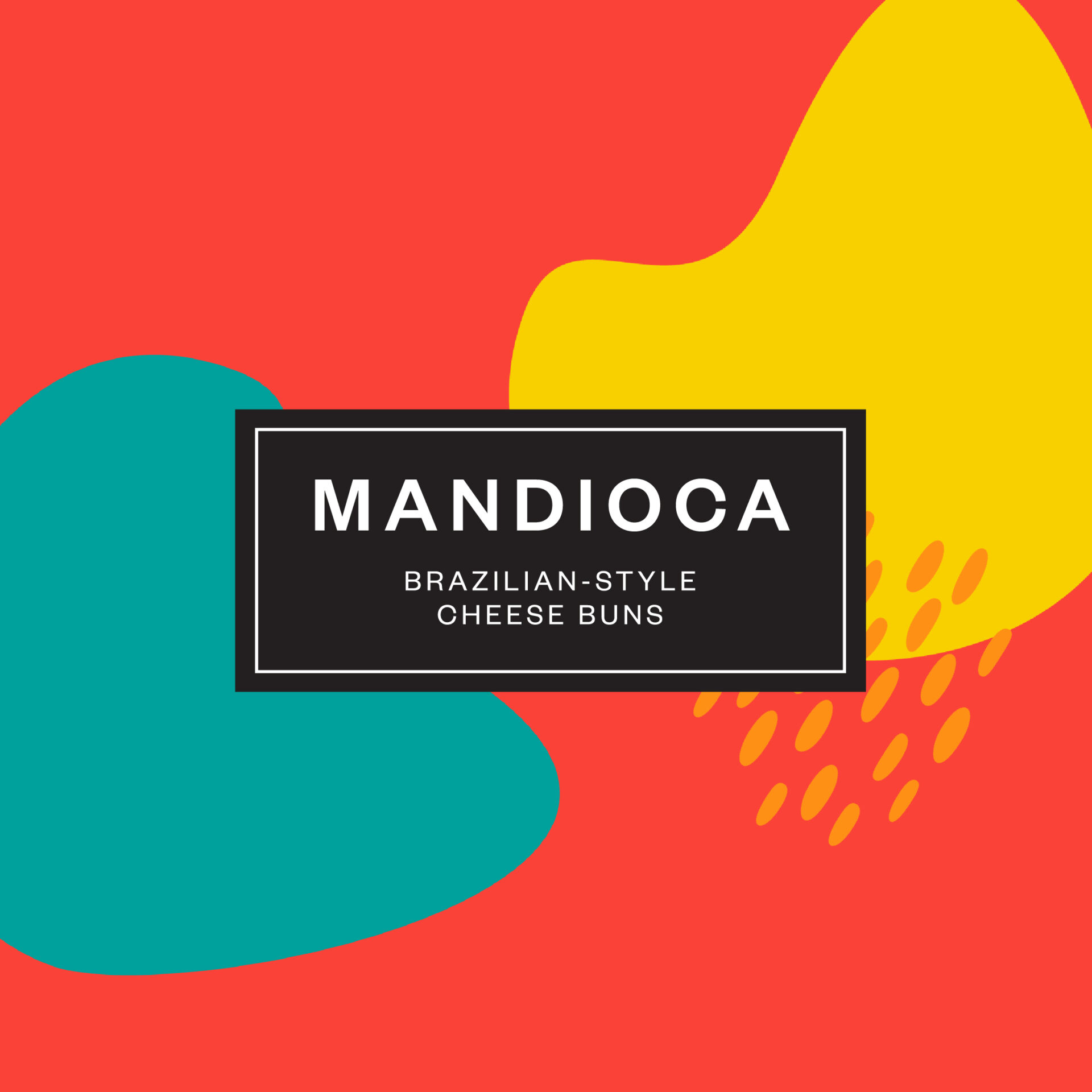
Mandioca Case Study
The Backstory:
Brazilian Cheese Buns have been a welcome addition to virtually every occasion, from morning coffee to big family gatherings, and everything in between for decades in South America. Given the uniqueness and root origin of this snack, there is a lot of North American sales potential.
Mandioca is a cheese bun manufacturer located in the Kitchener – Waterloo region. They are committed to offering delicious, nutritious, and easy-to-prepare buns that bring the traditions and tastes of South America to Canada and US markets.
The challenge Mandioca faced was to establish the best ‘go to’ market strategy, branding and packaging that will ultimately deliver its vision of operating a manufacturing facility and developing a distribution network.
What We Delivered:
Marketing Strategy
We began with building a strategic marketing plan for Mandioca that translates the business goals into marketing priorities and outlines how to execute and reach them. The first step involved market research including a “Take & Bake” test. The results were analyzed to determine the primary target audiences for the product. From the outcomes of the market research, our marketing plan comprehensively defined the four Ps to launch a new product and a new brand into new markets.
Branding & Packaging
The client initially was leaning towards a modern & clean idea for the packaging, much like other newer grocery products. Our team felt that this approach didn’t utilize the cultural strength of the product or the energy of the founder and so presented an option that pulled in visuals directly linked to Brazilian culture – textiles, patterns and colours.
The Mandioca team unanimously agreed with this more playful, vibrant design and gave the thumbs up to roll through all 4 flavours along with product photography (wonderfully executed by Langen Studios) followed by a number of sales tools and marketing assets.
Website
To support the team work towards their sales goals, the website needed to introduce the brand and position the products as healthy, good-for-you snacks for Canadian families to enjoy. It also supported distribution partners with a “where to buy” section, making it easy for consumers to find the stores selling the buns.
Building on the playful elements introduced on the packaging, the website visuals continued to deliver a consistent brand experience. (For more of what we delivered, check out this page.)
The Results:
Mandioca products have been on the shelves of more than 100 stores in the GTA, as well as being offered through a Quebec distributor. They continue to negotiate to enter the big retail chains as well.
Industry
Food & Beverage
Discipline
Marketing
Strategy
Packaging
Brand Development
Website
Project Team
Erynn Hayden
Philip Mondor
Janice Powell
Contributors
Langen Studios
Sustainable Waterloo Region Case Study
The Backstory:
The idea for Sustainable Waterloo Region (SWR) began 10 years ago from research projects at Wilfred Laurier University’s School of Business. It included the potential for a not-for-profit aimed at helping organizations achieve carbon reductions through support, networking, best practices, education and more.
With a vision for an environmentally and economically resilient community that prioritizes the wellbeing of current and future generations, SWR’s first educational forum was hosted in January 2009 with over 200 people in attendance and the idea came to fruition!
Since then the organization’s many volunteers and members have used their passion for building sustainable business and community practices. This contagious passion has seen membership grow each year. With a focus on energy (including waste and water), mobility and green buildings, their ideas and programs have also inspired countless projects within the Region’s private and public organizations. These initiatives have also been presented at both the provincial and federal levels to further inspire and share proven sustainable practices and organizations.
The Ask:
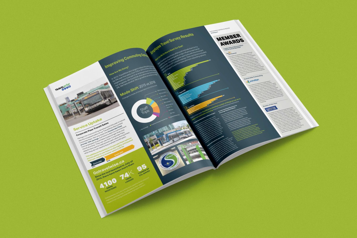
SWR is an organization with a small staff focused on running its programs, building awareness and increasing membership. To support this core team, multiple volunteers help in creating event materials and marketing communications over the course of the year. With many different volunteers designing communication pieces, SWR needed something that would provide visual guidance for materials. They also needed to establish a benchmark that volunteer designers could follow. They came to Studio Locale and together we determined that the Year End Report would be the perfect piece to not only double as a visual brand guide, but also to further support their membership goals as an invaluable marketing / business development tool.
The goals for the finished pieces were to:
- Give the year end report an exciting visual refresh and present the content in more digestible bits. This would encourage readership of the incredible activities and accomplishments of the previous year
- Elevate the design to present well to leaders in the business community, as well as to local, provincial and federal governments
- Present the stories, facts and member results in a compelling, easy to understand manner
- Produce the yearly reports with no additional environmental impact or print costs from previous years
- Continue to use 100% post consumer content paper
What we delivered:
The first year saw some heaving lifting to set up a report template that would work for the next few years. This involved starting with reorganizing the overall flow of the sections as well as the stories and facts within each to allow some visual “space” on the pages. This adjustment makes the information much more digestible and understandable for readers.
With the framework for the report set, we could focus on developing a visual. For each year, we would sit with the team to understand the organization’s focus for the coming year and how it related to the activities of the past year.
Keeping with their existing colour palette, each year built on the previous visually while supporting their theme for the year. Sustainable Waterloo Region received:
- A new visual look and feel each year based off of their year end theme
- Yearly reports, each one visually unique that had longevity to support marketing activities throughout the year
- Well thought out, coherent year end reporting
- By the numbers section was reorganized to make understanding easier
- Showcasing of the member results allows them to shine and feel proud of their accomplishments over the past year. Rethinking how these results are showcased presented them in a more clear manner, giving them each the level of recognition they have worked so hard to achieve.
- Introduced icons, tightened colour and font use to create a more cohesive feeling going through the report, year over year
- A tight, clear, presentation of their team’s stories and its members accomplishments over the past year and future goals.
- An impactful spread / fold out that highlighted all of the results from the previous year to show member progress towards their targets
You can see more from each year end report below:
What happened next:
Sustainable Waterloo Region has heard nothing but positive feedback on the reports. Their professional appearance has supported the extremely professional approach the organization takes towards its programs and partnerships. As the team works closely with a number of different groups within the region, the report has given them additional credibility in the sustainability space as they work through new initiatives and bring on new members.
Specifically, the member reporting section, fondly referred to as the ‘baseball cards’, has been a huge benefit for the team. The ability to graphically present measurable results against specific targets demonstrates the significant impact its members are having on greenhouse gas emission, waste and water reductions.
The reorganization of the content by each program has meant that the program teams have marketing material specific to their individual areas as well. No longer are they needing to pull together a separate piece, relying on volunteers or partners to create it. Each program receives an isolated PDF of their pages to share and send out as needed. And the continuity between all of the programs further strengthens the organization’s overall brand.
For SWR’s members, the enhanced recognition each receive in the report has led to greater value for their membership. The report is now a piece that they can use to demonstrate their efforts towards sustainability and how they are driving a culture of positive action and change.
The report is also being used beyond Waterloo Region by other organizations to show what is possible when it comes to supporting sustainability within a community, how to engage its members and encourage them to implement impacting changes and how to measure that impact.
Industry
Not For Profit
Discipline
Year end report, marketing materials
Project team
Ceri Higgs
Erynn Hayden
Jessica McLachlan
Phil Mondor
Robin Mondor
Interns
Sebastian Bailey
Ceri Higgs
Tanner Garniss-Marsh
Jessica McLachlan
Myah Stover
What you and your business need to know about CASL
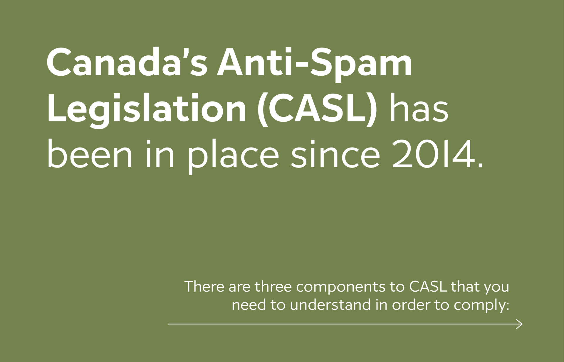
Canada’s Anti-Spam Legislation (CASL) has been in place since 2014
It feels like FOREVER ago, but the reality is we still come across clients who don’t know what it is or how it applies to them.
Here’s the short of it, if you are a company or for-profit organization and you send electronic messages to Canadians trying to sell them your products/services, then CASL applies to you. We know from our conversations both internally and with clients that the topic of CASL fills people with anxiety and stress, while also boring them to death, which generally leads to ignoring and putting off doing the work needed to ensure you’re being compliant. We TOTALLY get it, and we want to help. In this article, we’re going to attempt to break CASL down in layman’s terms, make it more accessible and less scary.
Here we go!
What exactly is CASL?
As we mentioned above, CASL stands for Canada’s Anti-Spam Legislation. It is a set of laws that have been created to help protect Canadians from the misuse of electronic marketing communication by businesses and organizations sent for the express purpose of selling. In other words, CASL is protecting you and your inbox from the annoyance of spam. If you’ve done any reading on CASL, you’ve probably seen the term CEM. CEMs are commercial electronic messages – these are the potential spam we’re talking about above.
Quick note: It’s important to understand that electronic messages include emails, text messages, instant messages, direct messages, or certain social media messages sent to another electronic address. We’re mainly talking about emails in this post because that’s generally the way our clients are communicating with their audience, but if you do use any of these other forms of communication it’s important that you recognize that they also need to be compliant.
There are three components to CASL that you need to understand in order to comply:
- Obtain consent before you can send any messages to anyone (we tackle consent further in the next section).
- You must provide clear identification information in your message (people have to know who they are receiving the message from, including a business address).
- You must, must, must provide a clear and easily found way for people to unsubscribe from your email list. And just to round this out, there are scenarios where CASL does not apply. You can read more about those here.
Why is consent important?
When talking about CASL there are two types of consent you need to be aware of and filter all of your communication through:
- Implied – valid for up to 2 years
- Express – valid until the person unsubscribes
You have implied consent to send an electronic message to someone if one of the following scenarios is true:
- They’ve bought something from you in the last 24 months
- You’re a registered non-profit or political organization and the person you are emailing has donated to, volunteered for, or attended a meeting pertaining to your cause
- You’ve collected business cards or been otherwise given or found an email that was published publicly and that person hasn’t expressly published or said that they don’t want spam or unsolicited messages.
If none of the above scenarios are true then you must have express consent to send electronic messages. Express consent looks like having a record of either their written or oral permission to send them communication.
NOTE: It is recommended that, even if you have an existing business relationship with someone (implied consent), you put proper mechanisms in place to capture express consent to continue to communicate with them beyond the specific reason that you connected in the first place. For instance, if someone buys something from you, they should receive an opt-in message that gives them the opportunity to give you express consent to continue to communicate with them after that initial transaction has taken place. If they choose not to opt-in at that point, it’s probably safer for you to remove them from your active communication list.
What happens if my business doesn’t follow CASL?
It can vary, but the short and the long of it is that your company or organization could face fines of up to $10 million, criminal/civil charges, and/or personal liability for officers and directors. All of this, because your e-communications aren’t compliant?! No, thank you. Do yourself a favour and keep reading for what to do next.
Steps to follow to get your business CASL compliant
You’re reading this post, so that’s step #1!
Clearly, you care about your business and understand that if left unchecked, your communication strategy (or lack thereof) could have very real, very negative impacts on your business. So, let’s have a look at what you can be doing right now to get your business CASL compliant:
- Do a review of every kind of electronic communication your company sends and categorize them by the type of communication (CEM, customer service, etc) and the communication vehicle (newsletter, campaign, text, etc.).
- Create a system for reviewing all communication your company or organization does, and using the information from step 1, create filters and checks and balances for your communications to go through before they get sent (eg. – who is receiving each form of communication and how/when did you receive consent to send these messages to them?)
- If you aren’t using an email marketing system like MailChimp or Constant Contact, do your homework to decide which one is right for you and then start using it for all of your email marketing communication. These systems have built-in checks and balances to help you with CASL compliance, so although they can cost money to use, they are totally worth it.
If you haven’t previously been using an email marketing system like this, then chances are you don’t know if you have proper consent for everyone on your list, and you likely don’t have a record of how that consent was received. Don’t panic! Here’s what you should do:
- Refer to #3 above and choose the email marketing system that’s right for your business.
- Export your current email list in a .csv file format and upload it to your chosen email marketing system.
- Create an opt-in campaign/message that clearly tells everyone what kind of messages they can expect to receive from you and asks if they would like to opt-in to continue to receive these kinds of messages.
- Anyone who opts-in will be funnelled to a new list or lists, and anyone from the original list who didn’t opt-in can be scrubbed (removed) from your system.
- You should be left with a clean list of people who have given you express permission to connect with them, AND you will have a record of how you obtained that permission.
See? CASL isn’t THAT scary
CASL is a lot to take in, and if you haven’t been giving your e-communication any thought, it can also be a lot of work to get on track, but the alternative – hefty fines and/or? – is probably a lot worse. It’s worth the time and effort to ensure your company communications are compliant. We hope that this has helped to break down CASL into something that feels a little less scary and a little more doable. If you do have any further questions or need any other clarification, don’t hesitate to reach out to us. We’re here to help!
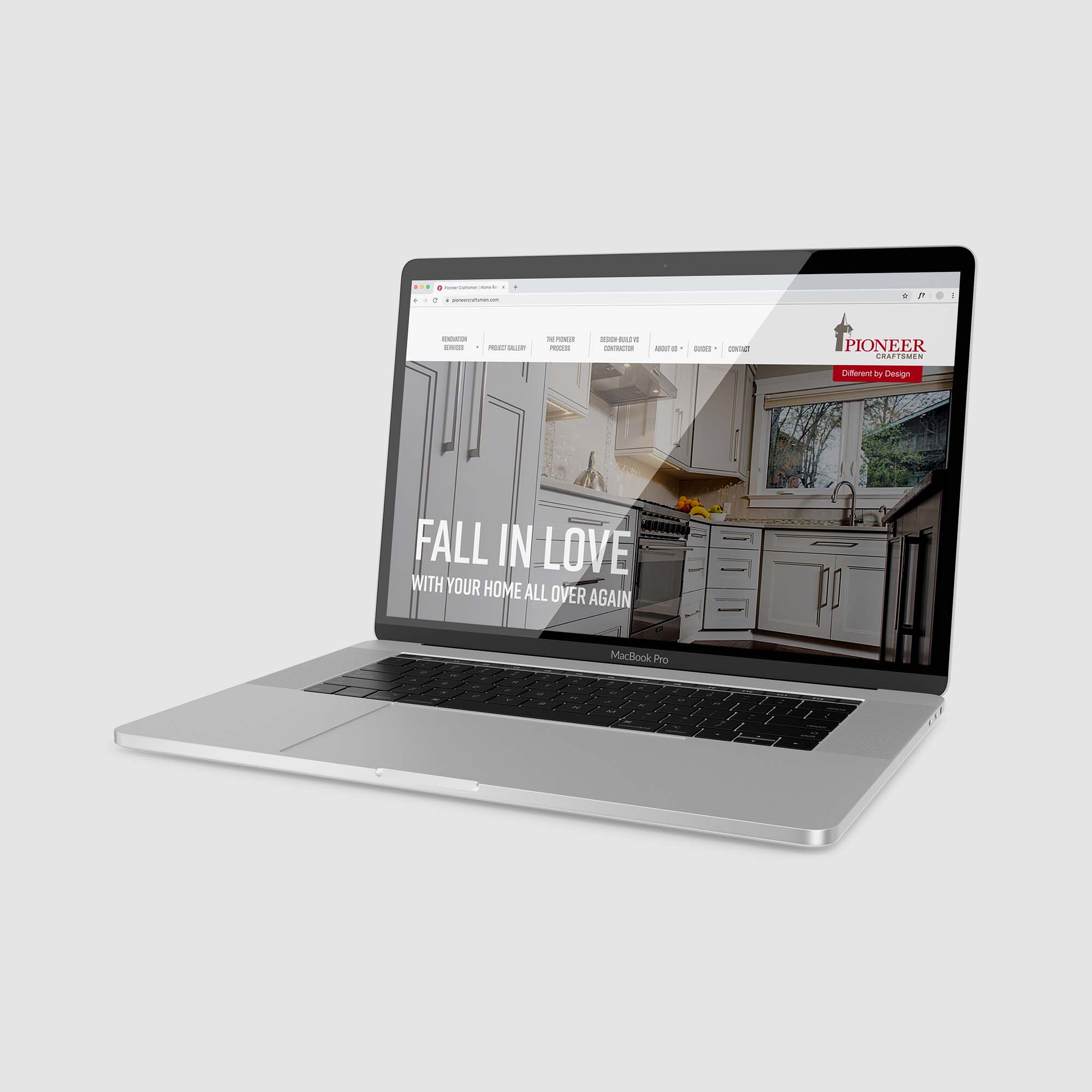
Pioneer Craftsmen Case Study
The Backstory:
For over 65 years, Pioneer Craftsmen has been one of Waterloo Region’s foremost design-build home renovation companies for clients who value exquisite design, quality craftsmanship, and exceptional service. As a third generation, family-owned company committed to improving everything it touches, Pioneer felt it was time to update its branding and website.
When Ken Adam founded Pioneer Craftsmen in 1953, he chose the Pioneer Tower to be the main focus of the company’s logo because it was an iconic local landmark (built in 1926) that represented Waterloo Region, its heritage, and stood the test of time thanks to great craftsmanship. These values were the same ones he wanted to instill in his new venture.
Although Pioneer’s logo subtly evolved over the years, it always maintained the traditional-styled tower illustration. While Pioneer cherished the family roots associated with this key design element, it was making the company’s identity appear traditional and dated. It was not indicative of the modern design and craftsmanship solutions Pioneer was offering its clients today.
The company’s website had also reached a point where it was time for an overhaul. While all of Pioneer’s award-winning projects were showcased, the visual design of the site was beginning to look dated, and the messaging was light on portraying Pioneer’s personality, proven process, and how it was different from other renovators.
The Ask:
Refresh the company’s logo with a modern look/feel to better reflect Pioneer’s forward-thinking design, elevated craftsmanship and approach, while keeping the tower icon in place to avoid losing any brand equity built over the last 65 years.
Develop a new tagline that clearly communicates how Pioneer’s renovations are different from its competitor’s; a slogan that only Pioneer can take ownership of given its strengths and reputation.
What We Delivered:
Logo
After conducting some research and developing an updated strategic brand plan, we got to work on refreshing the logo. It began with modernizing the style of the tower icon and ensuring it remained a recognizable landmark. Grey was chosen to create contrast with the rest of the logo and act as a secondary visual focus to Pioneer’s name. Next, the logo’s dark burgundy colour was replaced with a lively tone of red to add brilliance and vibrancy. Contemporary fonts were carefully selected for Pioneer Craftsmen’s name which blended serif and sans serif styles.
The wordmark was then thoughtfully integrated with the rejuvenated tower icon to create a fresh, beautifully balanced identity. The final logo successfully expresses Pioneer’s forward-thinking design and craftsmanship, while still paying homage to its founder and the beacon of lasting quality he wanted the company to be known for.
Tagline
Based on the brand plan and Pioneer’s positioning, “Different by Design” was developed as the new tagline. It clearly communicates what clients can expect when choosing Pioneer Craftsmen for their home renovation partner. The phrase immediately and successfully resonates with the company’s target market; those looking for something unique and far beyond the average home renovation. Not only does it place great focus on Pioneer’s unparalleled ingenuity and design solutions (which competitors typically contract out), it also reflects how the company’s approach has been designed to be purposefully different.
All of Pioneer’s projects are design-build, so its cohesive team of in-house designers and carpentry craftsmen can collaborate to develop (and build) the best design solutions. Using a proven four step process, Pioneer effectively takes the guesswork and unwanted surprises out of large home improvement projects for clients and replaces them with truly enjoyable experiences.
Pioneer also works differently by assigning a lead carpenter who is solely dedicated to one project. Combining this with its full-service capabilities ensures clients never have to play traffic coordinator between trades or be a budget master (like using a general contractor would require). Clients have peace of mind knowing there is one source, one responsibility for their home renovation and that they are in excellent hands with Pioneer Craftsmen.
Website
As the team works so transparently with their clients, it only made sense that the website should reflect this approach. With this in mind, Studio Locale worked with Pioneer to build an on-line experience that would clearly convey what clients could expect working with Pioneer.
The new website is rich with content, thoroughly outlining their process and showcasing completed projects. Each page takes visitors on a journey, from imagining the possibilities of a renovated space, to the completed project.
Supporting videos provide examples of what clients can expect working with Pioneer through each phase of the project, demonstrating the care all of Pioneer’s team members take to provide the best possible experience.
What Happened Next:
Pioneer’s new logo and tagline were rolled out across a variety of marketing pieces including stationery (including business cards, letterhead, envelope, e-signatures, note pads, thank you notes), roadside signage, vehicles, staff uniforms, newsletters, and the website.
The new identity has been a great success! Stakeholders are thrilled with the modern logo that stays true to the company’s roots, returning customers (who knew the original logo well) love the new look, and Pioneer’s staff continue to wear their uniform shirts with immense pride.
The website has been an extremely valuable marketing tool as well. Through strong SEO tactics, a comprehensive lead generation form, and the overall elevated experience, Pioneer successfully fills their team’s schedule with right-sized projects.
With comprehensive research, strategic marketing, and engaging visual design, Pioneer’s refreshed brand will continue to forcefully position them as Waterloo Region’s premier renovation team for many years to come.
“There was some concern for me at the very beginning of the process, but that concern was quickly overcome once I saw the depth you were proposing to go to learn about our company, our process, and what makes us different. From the initial meetings at our office reviewing our process with our team, to actual phone calls with our sales team playing the role of potential client, it was clear that the team at Studio Locale truly wanted to know the journey we take our clients on.”
Jamie Adam, President
Pioneer Craftsmen
Industry
Home Renovations
Discipline
Brand refresh, tagline, website, marketing materials
Project team
Anson LeClair
Erynn Hayden
Phil Mondor
Janice Powell
Contributors
High Rise Studios
Mike Powell
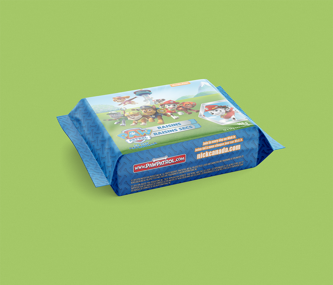
Maxwell Foods Case Study
The Backstory:
Excited to be bringing two products into the Canadian market, Maxwell Foods needed to update its packaging to meet Canadian requirements. The two products, Paw Patrol Raisins and Cepmix, were planned to ship in a relatively short period of time and turnaround times needed to accommodate their timeframe.
What We Delivered:
Starting with supplied UK packaging, we first began with updating the Paw Patrol Raisins for the Canadian market. Freshening the layout to continue featuring the Paw Patrol characters, we incorporated the French language requirements on all of the pieces – individual boxes, cellophane wrap, doy bags and shelf casing.
Because the Paw Patrol characters are a licensed element, we liaised directly with Nickelodeon to ensure their logo and character usage followed their branding guidelines. When you are presenting such well known television channel and its characters, it’s important that what is seen on the shelves matches with everything else – those little people are sticklers for the details (not to mention the higher execs!).
Next we moved onto the Cepmix packaging, a new, single serve adult snack of dried fruit and nut combinations. As a new product in the Canadian marketplace, the goal was to present a fresh product package while keeping true to the brand already established in other countries.
After recommending an updated colour palette for the 3 different varieties, we again adjusted the elements to incorporate the French language requirements. Subtle changes were also completed to enhance the ingredient imagery and appeal to the target demographics for the product.
With discussions underway to place the products in Loblaws, Shoppers Drug Mart and Walmart locations and no updated product imagery to share, actual size mock ups were created and supplied to support finalizing the distribution channels. We also helped prepare product image files for the retailer’s product systems – making sure the best quality images are available for the retailers to use in their promotional materials.
What Happened Next:
Both the Paw Patrol and Cepmix products are soon to be available in Loblaws and Walmart locations. With all of us committed to healthier eating for ourselves and our families, we are looking forward to having both the Paw Patrol Raisins and Cepmix snack boxes available to include in our lunches!
Industry
Food & Beverage
Discipline
Packaging
Project team
Erynn Hayden
Philip Mondor
Robin Mondor