

Martin Luther Case Study
A new name in need of a new visual brand
The Backstory:
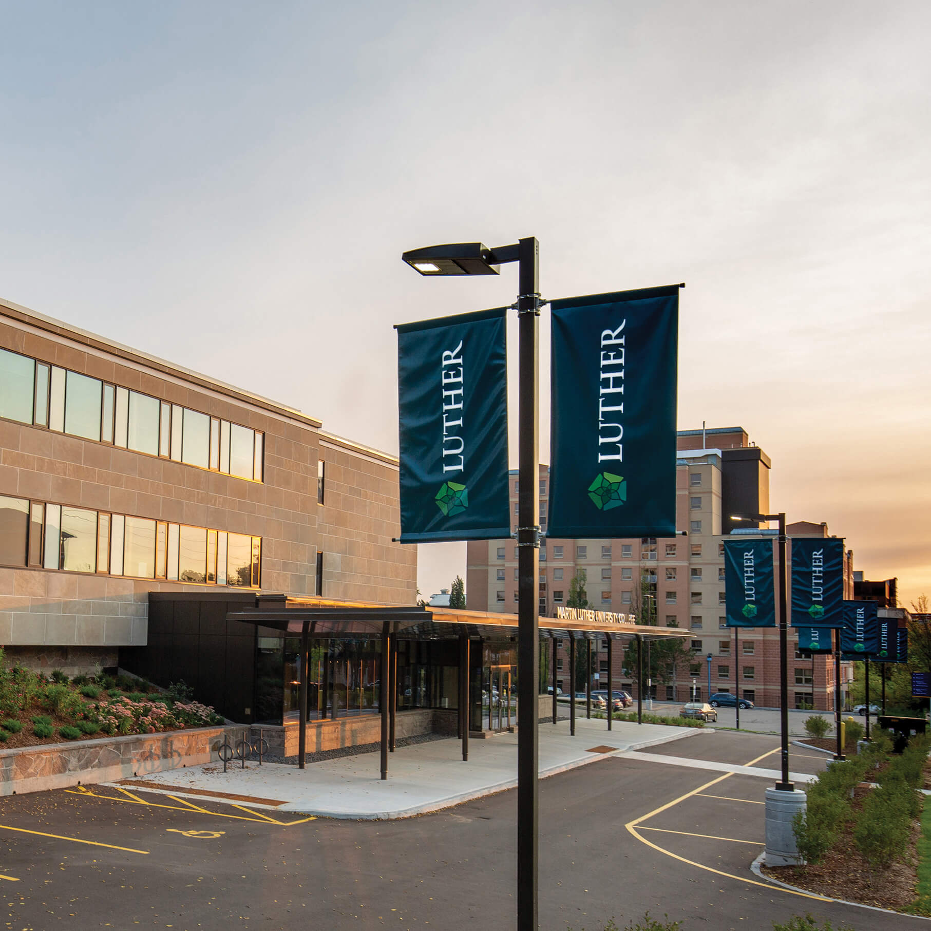
Martin Luther University College, formerly Waterloo Lutheran Seminary, is a founding educational institution within Waterloo region. Both Wilfred Laurier University and University of Waterloo can be traced back to the school, which now offers a multi-faith environment for both undergraduate degrees and master’s or PhD programs. After receiving approval for a name change, Martin Luther University College was in need of a new identity that paid homage to their past while reflecting their current vision and goals.
What We Delivered:
Brand Research
To start with a strong foundation, we began by growing our understanding of the Seminary’s history and the experiences of past students, faculty and the surrounding community. Their memories and stories identified aspects and areas, common across all of those interviewed, that reinforced the vision for Luther shared with our team. Grouping these insights into themes, the team had a well-balanced base and was ready to begin developing the initial ideas for the new visual identity.
Visual Identity
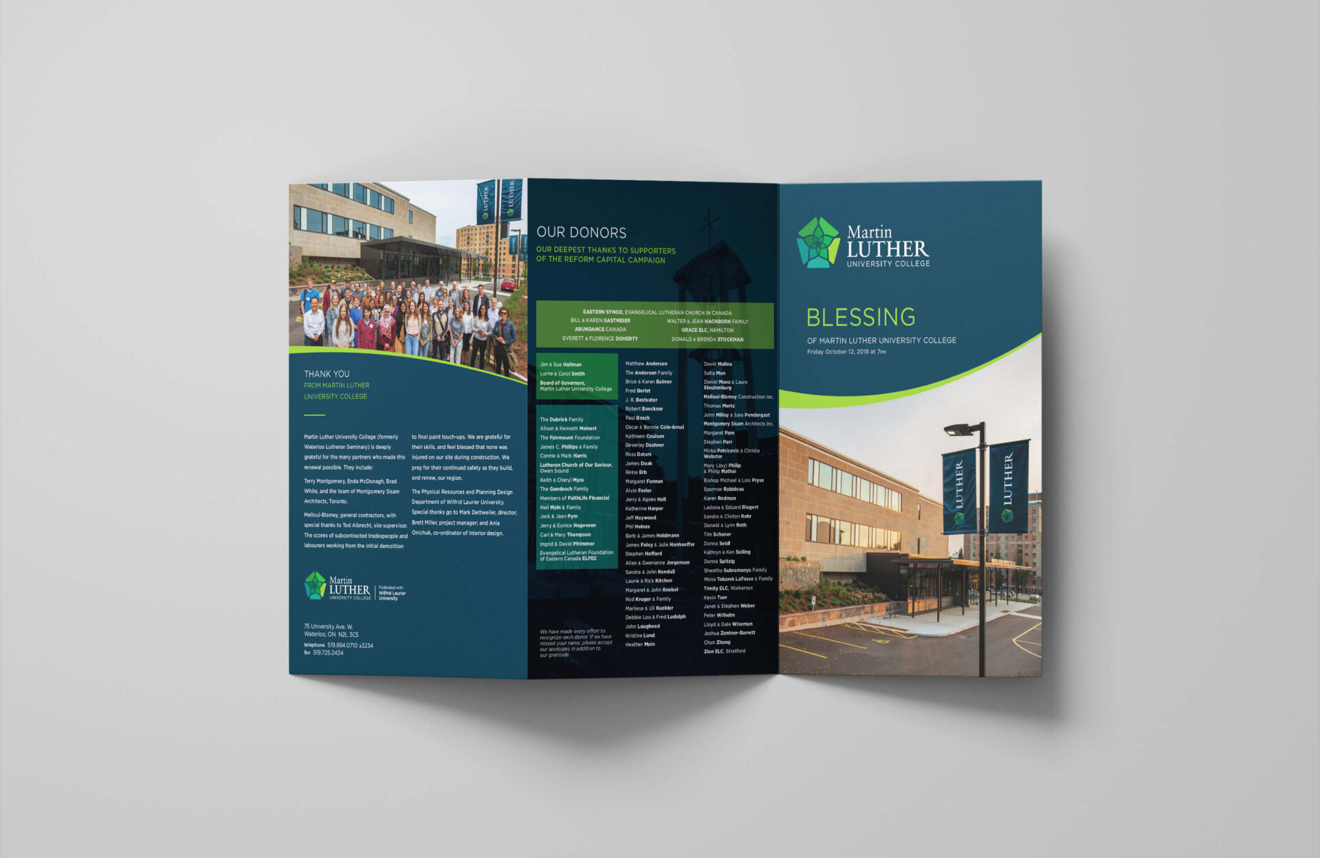
With the breadth and depth of insights gained through our research and interviews we explored a number of possible visual representations for Martin Luther University College. Working with the core team, these initial ideas were refined and whittled down to a handful of options that could be presented to the larger group that would be participating in the selection of the new identity. While the final decision would be made by the board, feedback and insight was sought from the faculty and staff as well. To keep the focus on the actual identity / mark and not differences in possible application, the presentation of ideas focused on the details of each concept and the rationale behind each, bringing the larger group into the journey of the design process. The selected direction was “The Ringing Rose”, an icon created that linked to the school’s history and an iconic feature of their Waterloo campus beside the full name of the school, visually emphasizing “Luther”, the informal reference to the school.
Brand Playbook
Following the selection and further refinement of the preferred direction, Studio Locale began the development of a brand playbook and communication templates that could be followed by their in-house creative team. We presented the new identity in a variety of applications including business cards, stationery, kit folders, brochures, an updated school seal and of course student swag. With these resources and examples, the team had what they needed to rollout the new identity across all of their marketing tools.
Brand Extension:
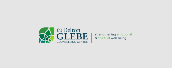
The Delton Glebe Counselling Centre
With the rebrand of Martin Luther University College, Delton Glebe Counselling Centre, a community program of Luther that provides mental health services to the community, needed its identity updated to follow the new look. A leaf shaped crop that incorporated their previous identity brought the centre’s look in-line with the new Luther visuals and clearly linked the two, something that was missing in the previous versions of both their identities.


Netflash Internet Solutions
Outsourcing a marketing team to support in-house resources
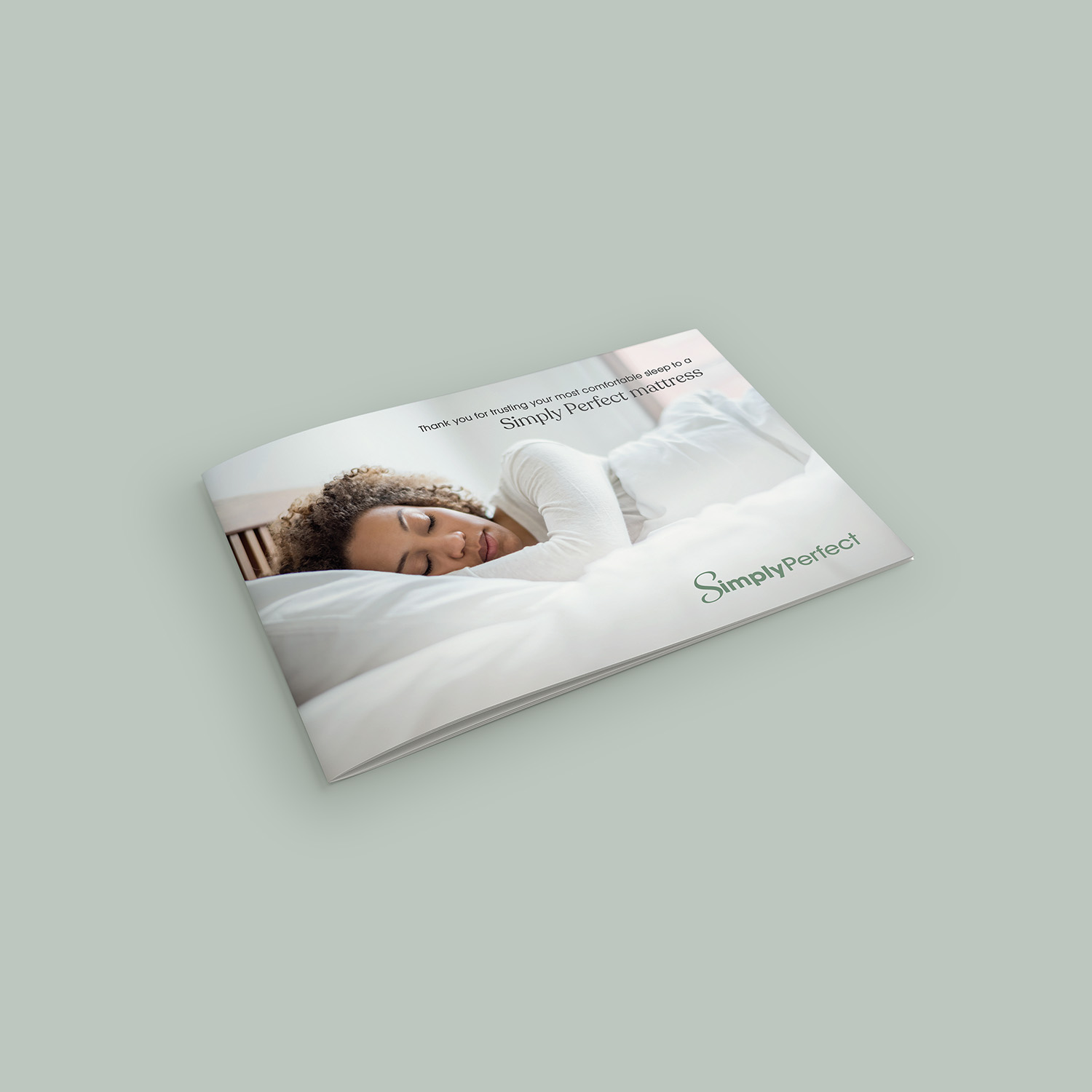
Simply Perfect
Reinforcing a local consumer product with an e-commerce website and digital campaign